Tangerine, canary, cobalt, vermillion, mint, cardinal purple, walnut, midnight—these are but some of the colours that punctuate designer Lim Wenhui’s apartment. Bright colours are often associated with loud and exuberant personalities, so it is surprising to find that she is drawn to such a rainbow palette given her elegant and tempered demeanour. “I like it. It makes me happy. If I don’t like it, I’ll just change it in my next home.”
And there you have it—beneath her cool exterior is the intrepid spirit that this psychedelic world embodies. “Perhaps it reflects my sense of adventure and experimentation? And the love of beauty,” she reiterates. If you look at the energising work of the founding director of Singapore-based architecture firm Spark, everything comes into place. In 2011, she helped to transform Starhill Gallery in Kuala Lumpur into a faceted jewel writ large with nary a straight surface in sight. She also breathed new life into the former POMO mall at Selegie with GR.iD—a youth social hub with a neon-lit Tetris grid structure and multi-hued graphics.

Lim had previously stayed in Singapore’s eastside, where her colourful collection of furniture and objet d’art popped against a white shell. In her hunt for a new place, she decided she wanted to go all out on the colour front. “I was seeking an older property with spacious interiors that I could convert. Fortunately, I came across Sherwood Towers. While it is a new location for me, I am always open to exploring new things and places. Sherwood Towers represents the next iteration, affectionately referred to as Project Moving House—a playful continuation of the design journey,”says Lim on the 43-year-old building in the west of the island.
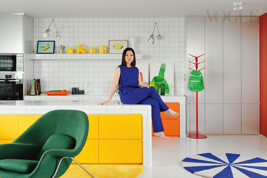
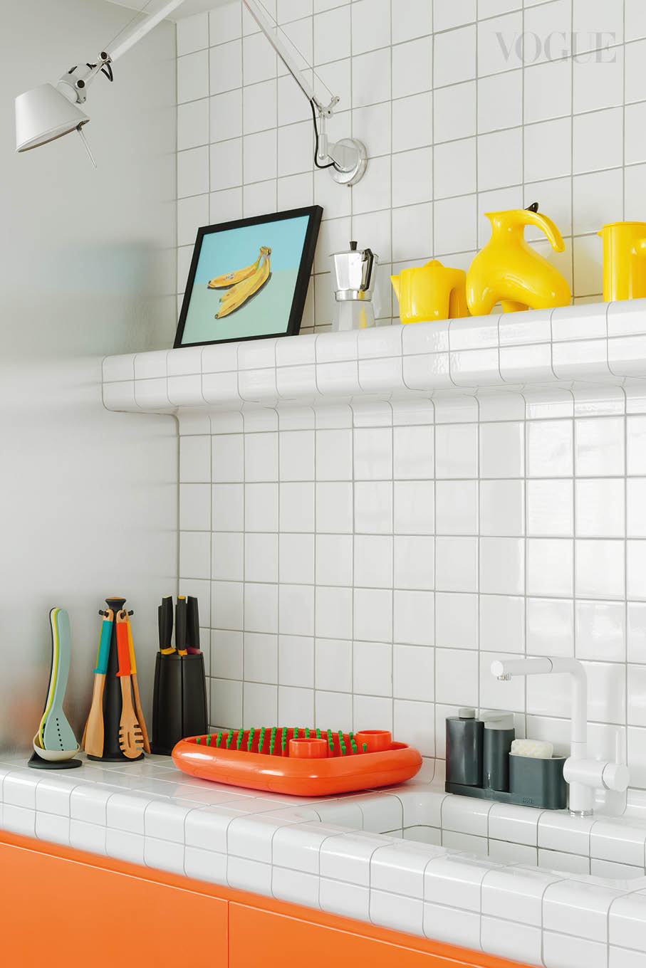
The apartment block’s dull grey exterior is the antithesis of Lim’s home. Through a dated lobby, up the nondescript lift and along an unremarkable corridor, one sights two doors, angled 45 degrees to each other. White and green strips on the panels are broken by oversized handles the shape of perfect circles.One walks into an open space where the kitchen, dining and living areas are loosely demarcated by furniture and rugs.White subway tiles wrap the kitchen counter, flowing around corners and down into the sink. Tangerine-coloured drawers echo the colour of a print by French designer Ronan Bouroullec, an orange Dish Doctor drying rack from Magis and a Flag coat standby Pedrali, while a quartet of yellow tableware and cups designed by Ole Jensen for Royal Copenhagen matches a banana painting by Montreal artist Isabella Di Sclafani.

Meanwhile, a sanguine Cannot side table from Cappelini and a large, rectangular carpet in carmine, scarlet and tangerine define one corner of the living area. Danish designer Hans J Wegner’s Ox armchair from Erik Jørgensen with its pronounced headrest is bunched together in a corner with a monochromatic Snoopy lamp from Flos and a black, larger-than-life Flos 265 wall lamp designed by Paolo Rizzatto. Another pair of armchairs upholstered in moss green stand nonchalantly within these micro mise en scènes.
The colour-blocked settings were intended to exude energy and vibrancy, decorated with beautiful objects that “spark joy”, shares Lim. The colour journey is more than mere appearance, reflecting an “inward journey to gain a better understanding of myself, simultaneously striving to align my external surroundings with my inner self. My aim is to achieve consistency from within and have it manifest in every aspect of my life, including my attitude, attire and the appearance of my physical environment.”

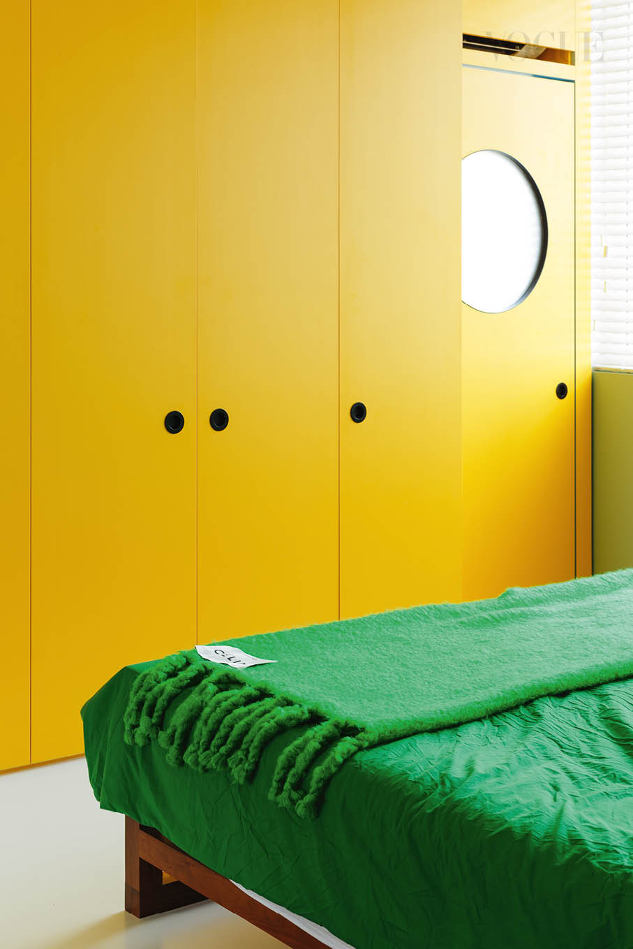
The walk-in wardrobe is one colour block of dark green, accented by azure-coloured doors to the bathroom and bedroom, and a red corner highlighted by a Cappelini Big Shadow floor lamp designed by the maestro of whimsy Marcel Wanders, a red table and a red painting. A single bedroom and study separate this space from the common areas. In plan, it is all very fluid, with the space from public to private layered clearly from the entry inward. Lim had demolished many walls to transform the apartment into one with fewer rooms but larger spaces. The former backdoor became the main entrance so that one sees the entire common area upon entry. The bedroom-cum-study was made by combining two former bedrooms, while the master bathroom enlarged by eating into part of a former bathroom.
It is not a typical home, Lim admits. There isn’t even a hob and stove in the kitchen. “I never liked how the usual kitchen felt like a back-of-house space—greasy, and full of stuff and clutter. I wanted it to be part of the main living spaces. The island counter is multipurpose. I use it for everything—doing work on my laptop, baking, folding laundry or just standing around it to have breakfast,” Lim explains.
So how does she cook? “Well, I don’t really cook,” she says. But if she wants to, she uses a portable cooker, the oven or microwave. “Even if I wanted to deep fry, I would get a deep fryer. I prefer this lifestyle.”

For the floor, she custom-made seven rugs in an assortment of shapes, sizes and colours. “I wanted the colour to spill onto the ground so that the space feels more three-dimensional,” says Lim. She carefully planned their placement so that they accentuate the character of each corner. For example, one is a semi-circular spot of buttercup that appears to flow out from under the kitchen island’s yellow drawers. Over at the dining area, a bulbous caterpillar-shaped carpet in baby blue and azure enlivens the quiet set-up of a structured LC6 dining table from Cassina and classic wooden Wishbone dining chairs from Carl Hansen & Søn.
There is also a multi-tone Flat Works rug from Hay in front of sliding mint-coloured panels that open to the bedroom, as well as a candy-like, blue-and-white Arch tufted rug from Ferm Living. Throwing playfulness into the mix is a Polar Bear rug designed by Teresa Moorhouse for Mum’s. In the powder room is an OrangeBook Rug designed by Jean Jullien and Jae Huh.
On Jullien, Lim is an avid admirer of the French graphic designer and illustrator’s popular cartoon-like works. She picks up a Bright Idea Lamp designed by him that stands sentry in the dining area alongside several Mao figures found at flea markets in China, switching it on to demonstrate the tongue-in-cheek reference of the lamp’s name as the bulb ‘head’ of the figurine lights up. A ‘Bob the bookend napper’ metal bookend produced by Jullien for Case Studyo & CG+ is also found in the study room.

“I follow Case Studyo, a publisher and producer of art that makes interesting limited-edition art objects and holds bids to release them. They are usually sold out within hours. They did a series with En Iwamura that I missed by a few days. I love the stuff they produce. They are little bits of energy for me,” says Lim. Also giving her good energy are the crystals. “I started collecting them because my energy was low during the pandemic.They really helped. These come as a pair,” she says on two perched on the console in the dining area like sculptures, their crystalline translucency reflecting light from the window.
Lim is also a believer in feng shui, applying it to the placement of colour around the home. For instance, the doors leading to the yard at the kitchen are finished in a glossy shade. The metallic facades of the oven and microwave shine on that corner as well.“The west is the colour of silver and white, so if you have silver and white in that direction, you’re following the natural order of things.But there are many colour schemes in any one direction; they just reinforce a sense of fun,” Lim highlights.
“I wanted the colour to spill onto the ground so that the space feels more three-dimensional.”
In another example, the sliding doors leading to the bedroom and study were coloured mint because green is the optimal shade for this east and southeast direction. “It means abundance. But green is also my favourite colour. I have a lot of green things in the apartment.” Truly, every shade of green dresses the home—from the mossy Knoll armchairs in the living area and the emerald-coloured bedcovers to the viridian tiles that envelop the master bathroom. In the latter, bright red joinery accompanies black tapware and washbasins, resulting in a punchy composition.
The home is also a foil for Lim’s designer lights, which were collected over the years and that have moved with her from one home to the next. They are placed in thoughtful ways to accent a wall or become features in space. In the kitchen, two slender silvery Tolomeo lamps from Artemide project from the wall. On the dining console, a petit Akari 1AG paper lamp designed by famed Japanese designer Isamu Noguchi accompanies the whimsical Bright Idea lamp.
This colourful setting is Lim’s childhood art adventures brought to life. “According to my mother, I used to draw all the time and she would wonder where the ideas came from. She deeply regretted not keeping the drawings,” she ponders. Architecture was the natural choice of study as it was the closest degree to art available at that time. Lim spent the formative years of her childhood in her grandparents’ home, where her uncles and aunties also stayed. “My grandparents’ flat had beautiful green terrazzo floor tiles, green kitchen wall tiles, light peach-painted walls and floral upholstery. It was lovely,” recounts Lim on thisWes Anderson-tinged memory.

After graduation, she worked at another office before joining Spark. “Spark was where I spent my defining years as an architect. I started as an intern in 2006 and did everything an architectural designer would do, including 3D modelling, drafting and working on Photoshop. My favourite activity was colouring drawings in Photoshop; it felt like making art,” says Lim.
Today, Lim has another artistic hobby. She is into storytelling using artificial intelligence text-to-image generator software, which she shares on social media under the Instagram handle ‘nice aunties’. “This art series was inspired by my 11 aunties, my mother and late grandmother. I aim to highlight the endearing and sometimes absurd behaviour of ‘aunties’ within the auntie culture prevalent in Asian communities worldwide,” she describes. Lim’s ‘nice aunties’ shimmy down the catwalk in bright poufy dresses inspired by fruit and colour-block, and go for forest walks riding giant soft toy bears.
While many prefer a neutral backdrop for daily living, Lim loves being in her colour-filled home. “It feels light and energetic. I love the quality of light, openness and connection to the views and greenery outside. I also like that the living room furniture arrangement feels organic and can have many layout possibilities with the smaller loose furniture rather than a traditional definitive central object like a piano or sofa.”Already, seeds have been planted for the next iteration.“The process also gave me ideas on what I want to improve and add on for my next home design.”


